Preparing Data
Overview
Teaching: 45 min
Exercises: 0 minQuestions
How do I prepare my library data for publication?
Objectives
Learn about cleaning and normalizing data
Cleaning Best Practices
Tidy Data
The idea of “tidy data” underlies principles in data management, and database administration that have been around for decades. In 2014, Hadley Wickham started to formalize some of these rules in what he called “Principles for Tidy Data.”
These principles are focused mainly on how to follow some simple conventions for structuring data in a matrix (or table) to use in the statistical programming language R.
In this section, we will give an overview of tidy data principles as they relate to data curation, but also try to extend “tidy data” to some of the underlying principles in organizing, managing, and preparing all kinds of structured data for meaningful use.
Tidy Data Principles
The foundation of Wickham’s “Tidy Data” relies upon a definition of a dataset which contains:
- A collection of values, and each value has a corresponding observation (row) and variable (column).
- A variable (column), contains values that measure the same attribute (or property) across all observations.
- An observation, contains all values (measured with the same unit) across all variables
More simply, for any given table we associate one observation with one or more variables. Each variable has a standard unit of measurement for its values.
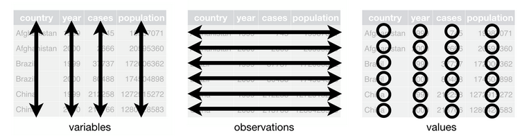
This image depicts the structure of a tidy dataset. It is from the open access textbook R for Data Science.
The following tidy data table includes characters appearing in a Lewis Caroll novel. The characters are observations, and the variables that we associate with each observation are Age and Height. Each variable has a standard unit of measurement.
| Name | Age | Height |
|---|---|---|
| Bruno | 22 | 61 inches |
| Sylvie | 23 | 62 inches |
Tidy Data Curation
The principles described above may seem simplistic and highly intuitive. But, often these principles aren’t followed when creating or publishing a dataset. This may be for a variety of reasons, but most obvious is that data creators are often working for convenience in data entry rather than thinking about future data analysis.
For data curators, the principles of tidy data can be applied at different points in time.
-
Upstream tidying: In working “upstream” a data curator is collaboratively developing standards to govern data collection and management. In this proactive work a data curator can advocate for these principles at the point in which data is initially made digital. Practically this might include working with the ILS to generate data apporopriately, or carefully constructing just the right SQL query.
-
Downstream tidying: More commonly, a data curator will receive some untidy data after it has been collected and analyzed. Working downstream requires tidying, such as restructuring and normalizing data, so that it adheres to the principles described above.
In working downstream, there are some additional data transformations that are helfpul for adhering to tidy data principles. These include using pivots to widen or make data longer, and separating or gathering data into a single variable.
Pivoting data
A pivot table is commonly used to summarize data in some statistical way so as to reduce or summarize information that may be included in a single table. In describing the “pivot” as it applies to a tidy dataset, there are two common problems that this technique can help solve.
First, a variable is often inefficently “spread” across multiple columns. For example, we may have the observation of a country and a variable like GDP that is represented annually. Our dataset could look like this:
| Country | 2016 | 2017 |
|---|---|---|
| USA | 18.71 | 19.49 |
| UK | 2.69 | 2.66 |
The problem with this structure is that the GDP variables are currently represented as annual values. That is, we have variables that are spread out across multiple columns when they could be easily and more effectively included as values for multiple observations.
To tidy this kind of dataset we would transform the data by using a long pivot. We will restructure the data table so that it is longer - containing more observations. To do this we will:
- Create a
Yearcolumn that can represent the year in which the GDP is being observed for a country. - Create a second column that can represent the GDP value.
- We will then separate the observations based on the year in which they occur.
Our new tidy dataset then looks like this:
| Country | Year | GDP |
|---|---|---|
| USA | 2016 | 18.71 |
| UK | 2016 | 2.69 |
| USA | 2017 | 19.49 |
| UK | 2017 | 2.66 |
Our dataset now contains four observations - USA 2016 and 2017 GDP, and UK 2016 and 2017 GDP. What we’ve done is remove any external information needed to interpret what the data represent. This could, for example, help with secondary analysis when we want to directly plot GDP over time.
The second type of data structuring problem that curators are likely to encounter is when one observation is scattered across multiple rows. This is the exact opposite of the problem that we encountered with spreading variables across multiple columns. In short, the problem with having multiple observations scattered across rows is that we’re duplicating information by confusing a variable for a value.
| Country | Year | Type | Count |
|---|---|---|---|
| USA | 2016 | GDP | 18.71 trillion |
| USA | 2016 | Population | 323.1 million |
| UK | 2016 | GDP | 2.69 trillion |
| UK | 2016 | Population | 65.38 million |
To tidy this kind of dataset we will use a wide pivot. We will restructure the data so that each column corresponds with a variable, and each variable contains a value.
| Country | Year | GDP | Population |
|---|---|---|---|
| USA | 2016 | 18.71 | 323.1 |
| UK | 2016 | 2.69 | 65.38 |
Our dataset now contains only two observations - the GDP and Population for the UK and USA in 2016. But, note that we also solved a separate problem that plagues the scattering of observations - In the first dataset we had to declare, in the value, the standard unit of measurement. GDP and Population are measured in the trillions and millions respectively. Through our wide pivot transformation we now have a standard measurement unit for each variable, and no longer have to include measurement information in our values.
In sum, the pivot works to either:
- Transform variables so that they correspond with just one observation. We do this by adding new observations. This makes a tidy dataset longer.
- Transform values that are acting as variables. We do this by creating new variables and replacing the incorrect observation. This makes a tidy dataset wider.
Separating and Gathering
Two other types of transformations are often necessary to create a tidy dataset: Separating values that may be incorrectly combined, and Gathering redundant values into a single variable. Both of these transformations are highly context dependent.
Separating
Separating variables is a transformation necessary when two distinct values are used as a summary. This is a common shorthand method of data entry.
| Country | Year | GDP per capita |
|---|---|---|
| USA | 2016 | 18.71/323.1 |
| UK | 2016 | 2.69/65.38 |
In this table we have a variable GDP per capita that represents the amount of GDP divided by the population of each country. This may be intuitive to an undergraduate economics student, but it violates our tidy data principle of having one value per variable. Also notice that the GDP per capita variable does not use a standard unit of measurement.
To separate these values we would simply create a new column for each of the variables. You may recognize this as a form of ‘wide pivot’.
| Country | Year | GDP | Population | GDP per Capita |
|---|---|---|---|---|
| USA | 2016 | 18.71 | 323.1 | 57.9 |
| UK | 2016 | 2.69 | 65.38 | 41.1 |
By separating the values into their own columns we know have a tidy dataset that includes four variables for each observation.
Gathering
Gathering variables is the exact opposite of separating - instead of having multiple values in a single variable, a data collector may have gone overboard in recording their observations and unintentionally created a dataset that is too granular (that is, has too much specificity). Generally, granular data is good - but it can also create unnecessary work for performing analysis or interpreting data when taken too far.
| Species | Hour | Minute | Second | Location |
|---|---|---|---|---|
| Aparasphenodon brunoi | 09 | 58 | 10 | Brazil |
| Aparasphenodon brunoi | 11 | 22 | 17 | Honduras |
In this dataset we have a very granular representation of time. If as data curators we wanted to represent time using a common standard like ISO 8601 (and we would, because we’re advocates of standardization) then we need to gather these three distinct variables into one single variable. This gathering transformation will represent, in a standard way, when the species was observed Yes, this frog’s common name is “Bruno’s casque-headed frog” - I have no idea whether or not this is related to the Lewis Caroll novel, but I like continuity.
| Species | Time of Observation | Location |
|---|---|---|
| Aparasphenodon brunoi | 09:58:10 | Brazil |
| Aparasphenodon brunoi | 11:22:17 | Honduras |
Our dataset now has just two variables - the time when a species was observed, and the location. We’ve appealed to standard (IS0 8601) to represent time, and expect that anyone using this dataset will know the temporal convention HH:MM:SS.
As I said in opening this section - the assumptions we make in tidying data are highly context dependent. If we were working in a field where granular data like seconds was not typical, this kind of representation might not be necessary. But, if we want to preserve all of the information that our dataset contains then appealing to broad standards is a best practice.
Tidy Data in Practice
For the purposes of this curriculum, using tidy data principles in a specific programming language is not necessary. Simply understanding common transformations and principles are all that we need to start curating tidy data.
But, it is worth knowing that the tidy data principles have been implemented in a number of executable libraries using R. This includes the suite of libraries known as the tidyverse. A nice overview of what the tidyverse libraries make possible working with data in R is summarized in this blogpost by Joseph Rickert.
There are also a number of beginner tutorials and cheat-sheets available to get started. If you come from a database background, I particularly like this tutorial on tidy data applied to the relational model by my colleague Iain Carmichael.
Extending Tidy Data Beyond the Traditional Observation
Many examples of tidy data, such as the ones above, depend upon discrete observations that are often rooted in statistical evidence, or a scientific domain. Qualitative and humanities data often contain unique points of reference (e.g. notions of place rather than mapped coordinates), interpreted factual information (e.g. observations to a humanist mean something very different than to an ecologist), and a need for granularity that may seem non-obvious to the tidy data curator.
In the following section I will try to offer some extensions to the concept of tidy data that draws upon the work of Matthew Lincoln for tidy digital humanities data. In particular, we will look at ways to transform two types of data: Dates and Categories. Each of these types of data often have multiple ways of being represented. But, this shouldn’t preclude us from bringing some coherence to untidy data.
For these explanations I’ll use Matthew’s data because it represents a wonderful example of how to restructure interpreted factual information that was gathered from a museum catalog. The following reference dataset will be used throughout the next two sections. Take a quick moment to read and think about the data that we will transform.
| acq_no | museum | artist | date | medium | tags |
|---|---|---|---|---|---|
| 1999.32 | Rijksmuseum | Studio of Rembrandt, Govaert Flink | after 1636 | oil on canvas | religious, portrait |
| 1908.54 | Victoria & Albert | Jan Vermeer | 1650 circa | oil paint on panel | domestic scene and women |
| 1955.32 | British Museum | Possibly Vermeer, Jan | 1655 circa | oil on canvas | woman at window, portrait |
| 1955.33 | Rijksmuseum | Hals, Frans | 16220 | oil on canvas, relined | portraiture |
Dates
In the previous section I described the adherence to a standard, ISO 8601, for structuring time based on the observation of a species. We can imagine a number of use cases where this rigid standard would not be useful for structuring a date or time. In historical data, for example, we may not need the specificity of an ISO standard, and instead we may need to represent something like a period, a date range, or an estimate of time. In the museum catalog dataset we see three different ways to represent a date: After a date, circa a year, and a data error in the catalog (16220).
It is helpful to think of these different date representations as “duration” (events with date ranges) and “fixed points” in time.
Following the tidy data principles, if we want to represent a specific point in time we often need to come up with a consistent unit of measurement. For example, we may have a simple variable like date with the following different representations:
| Date |
|---|
| 1900s |
| 2012 |
| 9th century |
Here we have three different representations of a point in time. If we want to tidy this data we will have to decide what is the most meaningful representation of this data as a whole. If we choose century, as I would, then we will have to sacrifice a bit of precision for our second observation. The tradeoff is that we will have consistency in representing the data in aggregate.
| Date_century |
|---|
| 18 |
| 19 |
| 9 |
But now, let’s assume that this tradeoff in precision isn’t as clear. If, for example, our dataset contains a date range (duration) mixed with point in time values then we need to do some extra work to represent this information clearly in a tidy dataset.
| Date |
|---|
| Mid 1200s |
| 9th century |
| 19-20th c. |
| 1980's |
This data contains a number of different estimates about when a piece of art may have been produced. The uncertainty along with the factual estimate is what we want to try to preserve in tidying the data. An approach could be to transform each date estimate into a range.
| date_early | date_late |
| 1230 | 1270 |
| 800 | 899 |
| 1800 |
1999 |
| 1980 | 1989 |
Our data transformation preserves the range estimates, but attempts to give a more consistent representation of the original data. Since we don’t know, for example, when in the mid 1200’s a piece was produced we infer a range and then create two columns - earliest possible date, and latest possible date - to convey that information to a potential user.
Another obstacle we may come across in representing dates in our data is missing or non-existent data.
| Date |
|---|
| 2000-12-31 |
| 2000-01-01 |
| 1999-12-31 |
| 1999- 01 |
We may be tempted to look at these four observations and think it is a simple data entry error - the last observation is clearly supposed to follow the sequence of representing the last day in a year, and the first day in a year. But, without complete knowledge we would have to decide whether or not we should infer this pattern or whether we should transform all of the data to be a duration (range of dates).
There is not a single right answer - a curator would simply have to decide how and in what ways the data might be made more meaningful for reuse. The wrong approach though would be to leave the ambiguity in the dataset. Instead, what we might do is correct what we assume to be a data entry error and create documentation which conveys that inference to a potential reuser.
There are many ways to do this with metadata, but a helpful approach might be just to add a new column with notes.
| Date |
Notes |
|---|---|
| 2000-12-31 | |
| 2000-01-01 | |
| 1999-12-31 | |
| 1999- 01-01 | Date is inferred. The original entry read `1999-01` |
Documentation is helpful for all data curation tasks, but is essential in tidying data that may have a number of ambiguities.
Let’s return to our original dataset and clean up the dates following the above instructions for tidying ambiguous date information.
| acq_no | original_date | date_early | date_late |
|---|---|---|---|
| 1999.32 | after 1636 | 1636 | 1669 |
| 1908.54 | 1650 circa | 1645 | 1655 |
| 1955.32 | 1655 circa | 1650 | 1660 |
| 1955.33 | 16220 | 1622 | 1622 |
We have added two new variables which represent a duration (range of time) - the earliest estimate and the latest estimate of when a work of art was created ^[You may be wondering why 1669 is the latest date for the first entry. Rembrandt died in 1669 - His work definitely had staying power, but I think its safe to say he wasn’t producing new paintings after that].
Note that we also retained the original dates in our datset. This is another approach to communicating ambiguity - we can simply retain the untidy data, but provide a clean version for analysis. I don’t particularly like this approach, but if we assume that the user of this tidy data has the ability to easily exclude a variable from their analysis then this is a perfectly acceptable practice.
Categories
LIS research in knowledge organization (KO) has many useful principles for approaching data and metadata tidying, including the idea of “authority control” ^[We’ll talk about this in depth in coming weeks]. In short, authority control is the process of appealing to standard way of representing a spelling, categorization, or classification in data.
In approaching interpretive data that may contain many ambiguities we can draw upon the idea of authority control to logically decide how best to represent categorical information to our users.
A helpful heuristic to keep in mind when curating data with categories is that it is much easier to combine categories later than it is to separate them initially. We can do this by taking some time to evaluate and analyze a dataset first, and then adding new categories later.
Let’s return to our original dataset to understand what authority control looks like in tidy data practice.
| acq_no | medium |
|---|---|
| 1999.32 | oil on canvas |
| 1908.54 | oil paint on panel |
| 1955.32 | oil on canvas |
| 1955.33 | oil on canvas, relined |
In the variable medium there are actually three values:
- The medium that was used to produce the painting.
- The material (or support) that the medium was applied to.
- A conservation technique.
This ambiguity likely stems from the fact that art historians often use an informal vocabulary for describing a variable like medium.
Think of the placard on any museum that you have visited – Often times the “medium” information on that placard will contain a plain language description. This information is stored in a museum database and used to both identify a work owned by the museum, but also produce things like exhibit catalogues and placards. Here is an example from our dataset.

But, we don’t want to create a dataset that retains ambiguous short-hand categories simply because this is convenient to an exhibit curator. What we want is to tidy the data such that it can be broadly useful, and accurately describe a particular piece of art.
This example should trigger a memory from our earlier review of tidy data principles - when we see the conflation of two or more values in a single variable we need to apply a “separate” transformation. To do this we will create three new variables to perform a “wide pivot”.
| acq_no | medium | support | cons_note |
|---|---|---|---|
| 1999.32 | oil | canvas | |
| 1908.54 | oil | panel | |
| 1955.32 | oil | canvas | |
| 1955.33 | oil | canvas | relined |
In this wide pivot, we retained the original medium variable, but we have also separated the support and conservation notes into new variables. ^[Note: I will have much more to say about this example and how we can use an “authority control” in future chapters]
Our original dataset also contained another variable - Name - with multiple values and ambiguities. In general, names are the cause of great confusion in information science. In part because names are often hard to disambiguate across time, but also because “identity” is difficult in the context of cultural heritage data. Art history is no exception.
In our original dataset, we have a mix of name disambugity and identity problems.
| acq_no | artist |
|---|---|
| 1999.32 | Studio of Rembrandt, Govaert Flink |
| 1908.54 | Jan Vermeer |
| 1955.32 | Possibly Vermeer, Jan |
| 1955.33 | Hals, Frans |
Let’s unpack some of these ambiguities:
- The first observation “Studio of Rembrandt, Govaert Flink” contains two names -
RembrandtandGovaert Flink. It also has a qualification, that the work was produced inthe studio ofRembrandt. - The third observation contains a qualifier
Possiblyto note uncertainty in the painting’s provenance. - All four of the observations have a different way of arranging given names and surnames.
To tidy names there are a number of clear transformations we could apply. We could simply create a first_name and last_name variable and seperate these values.
But this is not all of the information that our Name variable contains. It also contains qualifiers. And, it is much more difficult to effectively retain qualifications in structured data. In part because they don’t neatly fall into the triple model that we expect our plain language to take when being structured as a table.
Take for example our third observation. The subject “Vermeer” has an object (the painting) “View of Delft” being connected by a predicate “painted”. In plain language we could easily represent this triple as “Vermeer-painted-View_of_Delft”.
But, our first observation is much more complex and not well suited for the triple form. The plain language statement would look somoething like “The studio of Rembrandt sponsored Govaert Flink in painting ‘Isaac blessing Jacob’” ^[The painting in question is here]
To represent these ambiguities in our tidy data, we need to create some way to qualify and attribute the different works to different people. Warning in advanance, this will be a VERY wide pivot.
| acq_no | artist_1 1stname | artist_1 2ndname |
artist_1 qual |
artist_2 1stname |
artist_2 2ndname |
artist_2 qual |
|---|---|---|---|---|---|---|
| 1999.32 | Rembrandt | studio | Govaert | Flinck | possibly | |
| 1908.54 | Jan | Vermeer | ||||
| 1955.32 | Jan | Vermeer | possibly | |||
| 1955.33 | Hals | Frans |
Across all observations we separated first and second names. In the case of Vermeer, this is an important distinction as there are multiple Vermeers that produced works of art likely to be found in a museum catalogue.
In the third observation, we also added a qualifier “possibly” to communicate that the origin of the work is assumed, but not verified to be Vermeer. We also used this qualification variable for Rembrandt, who had a studio that most definitely produced a work of art, but the person who may have actually put oil to canvas is ambiguous.
We also created a representation of artist that is numbered - so that we could represent the first artist and the second artist associated with a painting.
Each of these approaches to disambiguation are based on a “separating” transformation through a wide pivot. We tidy the dataset by creating qualifiers, and add variables to represent multiple artists.
This solution is far from perfect, and we can imagine this going quickly overboard without some control in place for how we will name individuals and how we will assign credit for their work. But, this example also makes clear that the structural decisions are ours to make as data curators. We can solve each transformation problem in multiple ways. The key to tidy data is having a command of the different strategies for transforming data, and knowing when and why to apply each transformation.
In future chapters we will further explore the idea of appealing to an “authority control” when making these types of decisions around tidying data and metadata.
Summary
In this chapter we’ve gone full tilt on the boring aspects of data structuring In doing so, we tried to adhere to a set of principles for tidying data:
- Observations are rows that have variables containing values.
- Variables are columns. Each variable contains only one value, and each value follows a standard unit of measurement.
We focused on three types of transformations for tidying data:
- Pivots - which are either wide or long.
- Separating - which creates new variables
- Gathering - which collapses variables
I also introduced the idea of using “authority control” for normalizing or making regular data that does not neatly conform to the conventions spelled out by “Tidy Data Principles”.
Readings
- Rowson and Munoz (2016) Against Cleaning: http://curatingmenus.org/articles/against-cleaning/
- Wickham, H. (2014), “Tidy Data,” Journal of Statistical Software, 59, 1–23 https://www.jstatsoft.org/article/view/v059i10/v59i10.pdf (Optional - same article with more code and examples https://r4ds.had.co.nz/tidy-data.html)
Extending tidy data principles:
- Tierney, N. J., & Cook, D. H. (2018). Expanding tidy data principles to facilitate missing data exploration, visualization and assessment of imputations. arXiv preprint arXiv:1809.02264. (There are a number of very helpful R examples in that paper)
- Leek (2016) Non-tidy data https://simplystatistics.org/2016/02/17/non-tidy-data/
Reading about data structures in spreadsheets:
- Broman, K. W., & Woo, K. H. (2018). Data organization in spreadsheets. The American Statistician, 72(1), 2-10. https://www.tandfonline.com/doi/full/10.1080/00031305.2017.1375989
Teaching or learning through spreadhsheets:
- Tort, F. (2010). Teaching spreadsheets: Curriculum design principles. arXiv preprint arXiv:1009.2787.
Spreadsheet practices in the wild:
- Mack, K., Lee, J., Chang, K., Karahalios, K., & Parameswaran, A. (2018, April). Characterizing scalability issues in spreadsheet software using online forums. In Extended Abstracts of the 2018 CHI Conference on Human Factors in Computing Systems (pp. 1-9).
Formatting data tables in spreadsheets:
Exercise
Last week we looked at an infographic from ChefSteps that provided a “parametric” explanation of different approaches to making a chocolate chip cookie. This week - I present to you the data behind behind this infographic.
This is an incredibly “untidy” dataset. There are a number of ways we could restructure this data so that it follows some best practices in efficient and effective reuse. Your assignment is as follows:
- Return to your assignment from last week. How well did your structuring of the information match this actual dataset? (Hopefully you structure was tidier)
- Take a few moments to look through the dataset, and figure out exactly what information it is trying to represent, and what is problematic about this presentation.
- Come up with a new structure. That is, create a tidy dataset that has rows, columns, and values for each of the observations (cookies) that are represented in this dataset. You can do this by either creating a copy of the Google Sheet, and then restructuring it. Or, you can simply create your own structure and plug in values from the original dataset.
- When your sheet is restructured, share it with us (a link to your Google Sheet is fine) and provide a brief explanation about what was challenging about tidying this dataset.
Data Integration
The next section will focus on ‘grand challenges’ in data curation. A grand challenge in this context is a problem that requires sustained research and development activities through collective action. Data integration, packaging, discovery, and meaningful descriptive documentation (metadata) are longstanding grand challenges that are approached through a community of practitioners and researchers in curation. This chapter focuses on data integration as it operates at the logical level of tables, and data that feed into user interfaces.
Integration as a Grand Challenge
In the popular imagination, much of curation work is positioned as the activities necessary to prepare data for meaningful analysis and reuse. For example, when data scientists describe curation work they often say something to the effect of “95% of data science is about wrangling / cleaning”
Convert back and forth from JSON to Python dictionaries. pic.twitter.com/AOFXuKWhm3
— Vicki Boykis (@vboykis) April 13, 2019
If there are only two things I am trying to actively argue against in this class it is this:
- Curation is not just cleaning or wrangling data. It includes the attendant practices of making data contextually meaningful. This includes a good deal of cleaning or wrangling, but is much broader in scope than simply preparing data for analysis.
- Metadata is not just “data about data”. It is a complex and important knowledge organization activity that impacts nearly every aspect of data use. Every time someone says “metadata is just data about data” a tautology angel gets its wings.
In future weeks we will discuss practical ways to approach metadata and documentation that are inline with curation as an activity that goes beyond simply preparing data for analysis. This week however we are focused on conceptualizing and approaching the topic of data integration. The combining of datasets is a grand challenge for curation in part because of our expectations for how seemingly obvious this activity should be. Take a moment to consider this at a high level of abstraction: One of the spillover effects of increased openness in government, scientific, and private sector data practices is the availability of more and more structured data. The ability to combine and meaningfully incorporate different information, based on these structures, should be possible. For example:
- All municipalities have a fire department.
- All municipal fire departments have a jurisdictional mandate to proactively investigate fire code compliance.
- It follows, logically, that we should be able to use openly published structured data to look across jurisdictions and understand fire code compliance.
But, in practice this proves to be incredibly difficult. Each jurisdiction has a slightly different fire code, and each municipal fire department records their investigation of compliance in appreciably different ways. So when we approach a question like “fire code compliance” we have to not just clean data in order for it be combined, but think conceptually about the structural differences in datasets and how they might be integrated with one another.
Enumerating data integration challenges
So, if structured data integration is intuitive conceptually, but in practice the ability to combine one or more data sources is incredibly difficult, then we should be able to generalize some of the problems that are encountered in this activity. Difficulties in data integration break down into, at least, the following:
- Content Semantics: Different sectors, jurisdictions, or even domains of inquiry may refer to the same concept differently. In data tidying we discussed ways that data values and structures can be made consistent, but we didn’t discuss the ways in which different tables might be combined when they represent the same concept differently.
- Data Structures or Encodings: Even if the same concepts are present in a dataset, the data may be practically arranged or encoded in different ways. This may be as simple as variables being listed in a different order, but it may also mean that one dataset is published in
CSVanother inJSONand yet another in anSQLtable export. - Data Granularity: The same concept may be present in a dataset, but it may have finer or coarser levels of granularity (e.g. One dataset may have monthly aggregates and another contains daily aggregates).
The curation tradeoff that we’ve discussed throughout both DC 1 and DC 2 in terms of “expressivity and tractability” is again rearing its head. In deciding how any one difficulty should be overcome we have to balance a need for retaining conceptual representations that are accurate and meaningful. In data integration, we have to be careful not go overboard in retaining an accurate representation of the same concept such that it fails to be meaningfully combined with another dataset.
Data Integration, as you might have inferred, is always a downstream curation activity. But, understanding challenges in data integration can also help with decisions that happen upstream in providing recommendations for how data can be initially recorded and documented such that it will be amenable to future integration.^[A small plug here for our opening chapter - when I described a curators need to “infrastructurally imagine” how data will be used and reused within a broader information system, upstream curation activities that forecast data integration challenges are very much what I meant.]
Integration Precursors
To overcome difficulties in combining different data tables we can engage with curation activities that I think of as ‘integration precursors’ - ways to conceptualize and investigate differences in two datasets before we begin restructuring, normalization, or cleaning. These integration precursors are related to 1. Modeling; 2. Observational depth; and, 3. Variable Homogeneity.
Modeling Table Content
The first activity in data integration is to informally or formally model the structure of a data table. In DC 1 we created data dictionaries which were focused on providing users of data a quick and precise overview of their contents. Data dictionaries are also a method for informally modeling the content of a dataset so that we, as curators, can make informed decisions about restructuring and cleaning.
Here is an example of two data dictionaries for the same conceptual information: 311 service requests to the city of Chicago, IL and Austin, TX. Intuitively, we would expect that data from these two cities are similar enough in content that they can be meaningfully combined.
Before even before looking at the content of either data table we can assume there will be:
- A date
- A report of some service outage or complaint
- A location of the report or complaint, and
- The responsible city service that should respond.
The reality is much messier.

Even though these two cities record the same information about the same concept using the same data infrastructure (each city publishes data using a Socrata-based data repository) there are appreciable differences and challenges in integrating these two datasets. The annotations above point out some of these slight but appreciable differences:
-
Granularity - We can see that the Chicago dataset contains a variable
SR_Statusthat includes information about whether or not the request is open, as well as whether or not the request is a duplicate. The Austin dataset contains a similar variableStatusbut instead of also recording a duplicate here, there is a second variableDuplicatethat contains this information. That is, the Austin dataset is more granular. If duplicate information were important to retain in our integrated dataset we would need to determine a way to tidy these variables or values. -
Semantics - Both datasets include information about the most recent update (response) to the request, but these are variables are labeled in slightly different ways -
Last_Update_DateandLast_Modified_Date… This should be a simple to tidy by renaming the data variable (but as we will see, this proves to be more more challenging than just renaming the variable). -
Structure - Both datasets also include location information about the report. However, there is both different granularity as well as a different ordering of these variables. To tidy this location information, we would need to determine which variables to retain and which to discard.
The process of modeling our data tables before integration facilitates making accurate decisions, but also enables us to record those decisions and communicate them to end-users. A data dictionary, or a loose description of the contents of both tables, is often our first step in deciding which data cleaning activities we need to undertake for integrating data.
Determine the Observation Depth
In integrating two data tables there will likely be a difference in granularity of values. That is, even if the same variable is present in both datasets this does not necessarily mean that the same unit of measurement is used between the two data tables.
As curators, value granularity prompts a decision about what specificity is necessary to retain or discard for an integrated table.
A simple example will make this clear. Imagine we have three tables A, B, and C. Each table contains the same variable X, but the values for X in each table have a different observational depth. In comparing the values for this variable we might observe different units of measurement.
| A-X | B-X | C-X |
|---|---|---|
| 1 | 2 | 1.1 |
| 1 | 2 | 4.7 |
| 1 | 2 | 4.4 |
| 1 | 2 | 3.0 |
(Keep in mind - A, B and C represent the three different tables, and X represents the same variable found in all three tables)
This example looks simple at face value, but will require an important decision for integration. Tables A and B both represent observational values of X as integers (whole numbers that are zero, negative, or positive). Table C represents the observational values of X as an irrational number (with a decimal place).
Once we recognize this difference, our decision is simple - we can either convert the values in A and B to be irrational (1.0, 2.0, etc) or we can round the values in C to create integers.
Regardless of our decision it is important to note that we are not just changing the values, but we are also changing their encoding - that is whether they represent integers or irrational numbers. (And we would need to document this change in our documentation).
Let’s look at differences in observational depth from two variables in the 311 data described above.
| Created Date | Created Date |
|---|---|
| 4/20/20 10:14 | 2020 Apr 20 10:58:34 AM |
| 4/20/20 10:14 | 2020 Apr 20 10:57:21 AM |
| 4/20/20 10:14 | 2020 Apr 20 10:54:04 AM |
| 4/20/20 10:14 | 2020 Apr 20 10:52:39 AM |
| 4/20/20 10:14 | 2020 Apr 20 10:52:17 AM |
| 4/20/20 10:14 | 2020 Apr 20 10:46:53 AM |
| 4/20/20 10:14 | 2020 Apr 20 10:46:29 AM |
| 4/20/20 10:14 | 2020 Apr 20 10:43:44 AM |
| 4/20/20 10:14 | 2020 Apr 20 10:43:35 AM |
| 4/20/20 10:13 | 2020 Apr 20 10:43:29 AM |
| 4/20/20 10:13 | 2020 Apr 20 10:41:31 AM |
| 4/20/20 10:13 | 2020 Apr 20 10:40:38 AM |
| 4/20/20 10:13 | 2020 Apr 20 10:40:28 AM |
Chicago represents time of a 311 report following a MM-DD-YY HH:MM form, while Austin represents this same information with YYYY-MMM-DD HH:MM:SS 12HRM
The observational depth is greater (has more granularity) in the Austin table. But, we also have some untidy representations of date in both datasets.
If we want to integrate these two tables then we have to decide
- How to normalize the values; and,
- Which depth of granularity to retain.
Regardless of how we decide to normalize this data, what we have to try to retain is a reliable reporting of the date such that the two sets of observations are homogenous. For example, the Chicago data doesn’t include seconds for a 311 request. So, we can either add these seconds as 00 values in the Chicago table, or we can remove the seconds from the Austin table In either decision, we are changing the depth of granularity in our integrated table. (Note, we also need to transform the hours so that they either represent a 24 hour cycle, or are marked by a 12HR marking such as AM or PM).
Determine Variable Homogeneity
The last integration precursor that we’ll discuss has to do with the homogeneity of a variable. In modeling two or more tables for potential integration we will seek to define and describe which variables are present, but we’ve not yet identified whether or not two variables can be reliably combined. To make this decision we need to first determine the goals of the integration. Some general criteria to consider when thinkng about the goals of integration are as follows:
- Analysis and Computation - If we are optimizing data integration for easing analysis then we want high amount of homogeneity in the variables we will combine.
- Synthesis - If we are optimizing for a more general purpose, such as the ability to synthesize results from two different datasets, then we can likely afford to combine variables that may have less homogeneity
- Statistical Significance - If we expect to create statistical summaries that require significant results (that is we will make some decision or generalization based on our statistical analysis) then it is of the utmost importance that the combined variables have high homogeneity. But, if all that we require is a rough sense of when or where an observation occurs then low homogeneity is acceptable.
An example of variable homogeneity will help make these points clear. The Austin and Chicago tables each contain a variable that roughly corresponds with the “type” of 311 request or report being made. In the Austin table this information is more granularly reported - there is code that is used internally SR_Type_Code, and a Description variable that provides a plain text explanation of the code. In the Chicago table there is simply a variable called SR_Type. If we pay attention closely to the values in these two tables we can determine that the Description and SR_Type are homogenous. That is, the Austin table and the Chicago table have similar information but use slightly different semantic values to control the variable.
| Description | SR_Type |
|---|---|
| Tree Issue ROW | Aircraft Noise Complaint |
| ARR Missed Recycling | Vacant/Abandoned Building Complaint |
| Street Light Issue- Address | Tree Removal Request |
| Found Animal Report - Keep | Sign Repair Request - All Other Signs |
| Dangerous/Vicious Dog Investigation | Rodent Baiting/Rat Complaint |
| Traffic Signal - Maintenance | Rodent Baiting/Rat Complaint |
| ARR Dead Animal Collection | Aircraft Noise Complaint |
| ARR Dead Animal Collection | Rodent Baiting/Rat Complaint |
| ARR Missed Yard Trimmings/Compost | Rodent Baiting/Rat Complaint |
| ARR Missed Yard Trimmings/Compost | Fly Dumping Complaint |
| Animal Control - Assistance Request | Tree Debris Clean-Up Request |
| Street Light Issue- Address | Aircraft Noise Complaint |
| Street Light Issue- Address | Aircraft Noise Complaint |
| Street Light Issue- Address | Rodent Baiting/Rat Complaint |
Integrating these two variables in the same table seems possible, but we have a decision to make: We can either combine the two variables and leave the semantic value with low homogeneity, or we can create something like a controlled vocabulary for describing the type of 311 request being made and then normalize the data so that each value is transformed to be compliant with our vocabulary. For example, Street Light Issue - Address in the Austin table, and Sign Repair Request in the Chicago table both have to do with a report being made about public signage. We could create a broad category like Public Signage and then transform (that is, change the values) accordingly. But, we have only determined this step is possible by comparing the two variables directly.
When we determine there is a variable homogeneity that matches our intended integration goal we can then take a curation action. But, it is only through modeling, exploring observational depth, and investigating variable homogeneity that we can arrive at any one proper curation decision. It’s worth noting that the first two precursors - modeling and observational depth - don’t require us to necessarily have a goal in mind. We can start to engage in these activities before we quite know exactly what, or why we are going to integrate two tables. It is at the final step, variable homogeneity, that we start to formalize our goals and optimize our decisions as a result.
Horizontal and Vertical Table Integration
Thus far we’ve described precursors to making decisions and preparing data for integration. Once we’ve taken these steps we’re left with the practical task of combining the two tables. Generally, there are two types of table combinations that can be made: Horizontal and Vertical Integration.
Horizontal data integration
Horizontal data integration is necessary when we have the same set of observations, but multiple variables scattered across two tables. By performing a horizontal data integration we make a table wider by adding new variables for each observation. If you have any experience with databases this is also referred to as a join. To horizontally integrate data we perform left_joins or right_joins.
To accurately perform a horizontal data integration manually - that is copying and pasting between two datasets - it is necessary to make sure that each dataset has a shared variable (you can copy one variable between the two datasets if they do not already share one). When we copy and paste one table into another, we can then simply align the two shared variables to complete the integration.
I am also going to show you how how to perform a horizontal data integration using R … You do not have to follow these steps unless you are interested. To follow along you should download and install RStudio (select the RStudio Desktop free installation). These example comes from friends running the Lost Stats project.
# Install dplyr - a package in the tidyverse for restructuring data
install.packages('dplyr')

# Load the library by calling it in your terminal.
library(dplyr)

# The data we will use contains information on GDP in local currency
GDP2018 <- data.frame(Country = c("UK", "USA", "France"),
                  Currency = c("Pound", "Dollar", "Euro"),
                  GDPTrillions = c(2.1, 20.58, 2.78))

#To view the data we have just created follow the next step
View(GDP2018)

# Now we will create a second data set that contains dollar exchange rates
DollarValue2018 <- data.frame(Currency = c("Euro", "Pound", "Yen", "Dollar"),
                              InDollars = c(1.104, 1.256, .00926, 1))
In the initial steps above we have created two data tables and assigned these tables to the name GDP2018 and DollarValue2018.
To horizontally integrate these two tables we want to join or combine GDP2018 and DollarValue2018.
Use help(join) to see the types of joins that we can make in R.
To complete our horizontal data integration we simply do the following:
GDPandExchange <- left_join(GDP2018, DollarValue2018)

#We have now horizontally integrated our two datasets. To view this integrated dataset do the following
View(GDPandExchange)
One helpful note about the package dplyr that will clarify some of the magic that just happened… the join function will automatically detect that the Currency variable is shared in both data tables. In recognizing this shared variable dplyr will use this, automatically, as the place to perform the left join. And helpfully, when dplyr detects this similarity, it simply retains just one example of the Currency variables and its values. Voila - a single tidy data table through horizontal data integration !
Vertical data integration
Vertical data integration, which is much more common in curation, is when we have two tables with the same variables, but different observations. To perform a vertical integration we simply add new observations to one of our existing datasets. This makes our integrated data table longer because it contains more observations.
In R we first will subset a native data table (one that is included as an example) and then recombine it to see how vertical integration works in practice.
# Load the dplyr library so we can use its magic
library(dplyr)

# Load in mtcars data - a dataset that is native to R
data(mtcars)

# Take a look at the dataset and see what we will be first splitting and then recombining
View(mtcars)

# Split the dataset in two, so we can combine these back together
mtcars1 <- mtcars[1:10,]
mtcars2 <- mtcars[11:32,]

#Our comptuer is now holding the two tables in its memory - mtcars 1 and mtcars2. If you want to check this try

View(mtcars1)

# Use bind_rows to vertically combine the data tables
mtcarswhole <- bind_rows(mtcars1, mtcars2)

# The bind_rows command is simply concatenating or combing the two datsets one on top of the other.
# Now check to see the horizontally combined data tables
View(mtcarswhole)
These are the two most common integration tasks we will perform - integrating datasets with complimentary variables, and integrating datasets with new observations.
The hard part about data integration, as should be obvious by now, is in evaluating and preparing data to be combined. Once we have thoroughly completed each of the different integration precursors our task for actually integrating tables is relatively simple.
Summary
In this introduction to grand challenges in data curation we explored ways to prepare for and execute data integration at the table level. We first articulated a set of things that makes all data integration challenging:
- Differences in semantic content
- Differences in data structure and encoding
- Differences in data granularity
To overcome these challenges I proposed a set of integration precursors that included:
- Modeling data content
- Determining Observation Depth
- Determining Variable Homogeneity (its at this stage we start to formalize our integration goals)
Once these tasks were complete we looked at practical ways to combine two tables, including horizontal and vertical integration. We also were introduced to the magic of dplyr in performing simple data integrations.
Lecture
Readings
Data integration is a topic that can be incredibly complex, and much of the published literature fails to make this an approachable or even realistic read for a course like DC II. So, you get somewhat of a pass on readings this week.
A very helpful overview of the state of current integration challenges for the open web of data:
- Stonebraker, M., & Ilyas, I. F. (2018). Data Integration: The Current Status and the Way Forward. IEEE Data Eng. Bull., 41(2), 3-9. PDF
Please read this blog post for discussion (if you chose) on the Canvas forum:
- Whong, Chris (2020) “Taming the MTA’s Unruly Turnstile Data” Medium
Let me also make a plug for the Wikipedia article on data integration - this is a phenomenal overview that should compliment my writing above.
If you are interested in the history of this topic from the perspective of databases I also highly recommend the following:
- Halevy, A., Rajaraman, A., & Ordille, J. (2006, September). Data integration: The teenage years. In Proceedings of the 32nd international conference on Very large data bases (pp. 9-16). PDF
For a bit of historical background, Ch 1 of this book (pages 1-13) provides an excellent overview of how data were originally made compliant with web standards:
- Abiteboul, S., Buneman, P., & Suciu, D. (2000). Data on the Web: from relations to semistructured data and XML. Morgan Kaufmann. PDF
Exercise
The exercise this week comes from an interesting analysis of New York City 311 data by Chris Whong. What he observes is a 1000% increase in “Consumer Complaint” 311 requests since the first recorded case of Covid-19 infection in NYC. This is not without some important external conditions - After this recorded infection there was a more concerted effort by NYC residents to stockpile supplies. Having heard numerous informal complaints of price-gouging the city recommended that consumers report businesses using a 311 hotline.
A simple graph makes this more compelling than the narrative description - we see a huge spike in complaints beginning March 1st.

As savvy data curators, we might ask whether or not this trend holds across cities throughout the USA. And at its core, this is a data integration challenge. If we can find other city’s 311 data we should be able to reliably compare rates of 311 complaints over time. The challenge will be finding data that has the same kinds of variables, and normalizing values to have a one to one comparison between cities.
Lucky for us, there is an existing repository of 311 city data.
Your exercise this week is to choose two cities from this repository and attempt to integrate a subset of their data. This will be challenging.
Here are some helpful pointers:
- Choose cities that have “up-to-date” data (marked by “current” in the title)
- Subset this data so that it only includes 311 complains from March 1, 2020 forward. You can often subset data in a repository by choosing to view and filter the data first. Here is an example from Chicago’s open data portal (note just select filter in this interface)
- Once you have subsetted the tables for your two cities, try to eliminate any unnecessary variables from your dataset. That is - we don’t need all of the information about the data - we only need a record of, for example, the complaint and the date.
What to turn in:
- Provide us a table of your data from two cities (a Google Sheet or Excel document is fine). If you are able to integrate the data, provide just one sheet. If you cannot - give us two separate sheets. Note - this will be challenging to do. If you spend an hour trying to integrate the two datasets and up hating me (and this class) that is completely acceptable, but make an attempt and then follow the next step.
- Provide an explanation (~1 paragraph) of which cities you selected, what you tried to integrate the data, and why this was or was not challenging.
- You do not need to create a graph or any form of analysis - but if you do it would be very interesting to see your results!
Assignment 3: Data Transformations and Quality Criteria
In previous exercises we created a policy that specified what kind of data our repository should collect, from whom we would accept data deposits, as well as practical expectations about the size and formats we preferred to collect when collecting new data. In this activity we are going to establish policies for what we do with collected or deposited data.
Transfer
In an ideal scenario there is a clear transfer of ownership when data, documentation, and related resources are exchanged between one individual and another. But, often data are acquired, collected, or discovered in less than ideal scenarios. As data curators, we want to set up some general expectations about how data should be packaged or prepared for us to take-over responsibility for its preservation and reuse. Some general questions to consider when developing a data transfer policy:
- How will users or curators upload data to your repository? What kind of authenticity checks would you perform to make sure this data is what it purports to be? Does this include any virus scanning tools? (hint: CKAN provides some easy answers to this)
- How will you identify confidential, sensitive, or private information contained in this data? (in other words, What constitutes private or sensitive information?O What is your policy for removing / redacting / protecting this kind of content?
- How will you apply an identifier to each data collection? What kind? Why?
- What additional metadata (beyond what the depositor provides) should be created at the point of data being transfered to your stewardship?
- Is there any additional documentation that should be created in order to meaningfully preserve or use this data?
Transformation
Taking ownership (or stewardship) of a data collection may be just the first step in an extended workflow of preparing the data for being ingested by a repository, stored for long term preservation, or prepared for discovery and meaningful reuse in a data catalog.
Of course, transforming data to meet the needs of our users is one of the primary (and most time consuming) activities in data curation. The time we spend doing this is a direct function of the perceived value we have for the data we are curating. That means that we should try to establish policies that are appropriate for the sensitivity, uniqueness, and value of the data we are transforming. Consider the following questions as you begin to write out a policy about how data should be transformed for your protocol. Think about writing this section in the spirit of our previous reading on ‘How to share data with a statistician’.
File / Format
- In what formats should the data be stored? Does this differ from how it should be served to end-users? If so, how might you describe the policy for transforming data from one format to another (e.g. when you will create a CSV from a set of tables in a database)
- Will you accept data that are stored in proprietary formats? How will you communicate this to users?
- How will you record, store, and provide end-users information about what changes you’ve made to a dataset? (e.g. When you migrate file formats, or update the data you could then change the version of the dataset from 1.0 to 2.0? Conversely, you could have an “updated_last” field in your metadata, etc.)
Data Values
- What steps should be taken to normalize the data? (hint: You could go through something like
common transformsin Refine and come up with an easy (and exhaustive) template). Consider common transformations like: consistent column (variable) names, developing a data dictionary for each dataset, standardizing values for missing or null values, labeling values (by type - e.g. text, number, boolean, categorical, etc.) - Return to the principles of Tidy Data (e.g. Each variable you measure should be in one column; Each different observation of that variable should be in a different row; There should be one table for each “kind” of variable; and, If you have multiple tables, they should include a column in the table that allows them to be joined or merged). How would you help ensure that these principles are met for data that you collect?
Tutorial: Cleaning Library Data with OpenRefine
This will be a combination of exercises and learning about data retrieved from an Integrated Library System. We will start with circulation data that the Sno-Isle Library System in WA kindly provided to us.
Sno-Isle uses Polaris ILS. In order to gather six months of circulation by title data, the IT Manager ran the following SQL query to generate a csv:
select COUNT(distinct th.TransactionID) as [TotalCheckouts],
     br.BrowseTitle as [Title],
	   br.BrowseCallNo as [CallNumber],
	   br.BrowseAuthor as [Author],
	   o.Abbreviation as [OwningLibrary],
	   bs.data as [Publisher],
	   br.PublicationYear as [CopyrightDate],
	   MAX(ir.LastCircTransactionDate) as [DateLastBorrowed],
	   c.Name as [itype],
	   mt.Description as [ItemCode]
from PolarisTransactions.Polaris.TransactionHeaders th (nolock)
LEFT JOIN PolarisTransactions.Polaris.TransactionDetails tdmt (nolock)
	on th.TransactionID = tdmt.TransactionID and th.TransactionTypeID = 6001 and tdmt.TransactionSubTypeID = 4 --material type
LEFT JOIN PolarisTransactions.Polaris.TransactionDetails tdc (nolock)
	on th.TransactionID = tdc.TransactionID and tdc.TransactionSubTypeID = 61 -- collection
LEFT JOIN PolarisTransactions.Polaris.TransactionDetails tdi (nolock)
	on th.TransactionID = tdi.TransactionID and tdi.TransactionSubTypeID = 38 -- item record
LEFT JOIN Polaris.Polaris.ItemRecords ir (nolock)
	on ir.ItemRecordID = tdi.numValue
LEFT JOIN Polaris.Polaris.BibliographicRecords br (nolock)
	on br.BibliographicRecordID = ir.AssociatedBibRecordID
LEFT JOIN Polaris.Polaris.Organizations o (nolock)
	on o.OrganizationID = ir.AssignedBranchID
LEFT JOIN Polaris.Polaris.MaterialTypes mt (nolock)
	on mt.MaterialTypeID = tdmt.numValue
LEFT JOIN Polaris.Polaris.Collections c (nolock)
	on c.CollectionID = tdc.numValue
LEFT JOIN Polaris.Polaris.BibliographicTags bt (nolock)
	on bt.BibliographicRecordID = br.BibliographicRecordID and bt.TagNumber = 264
LEFT JOIN Polaris.Polaris.BibliographicSubfields bs (nolock)
	on bs.BibliographicTagID = bt.BibliographicTagID and bs.Subfield = 'b'
where th.TranClientDate between DATEADD(MM, -6, GETDATE()) and GETDATE()
GROUP BY br.BrowseTitle, br.BrowseCallNo, br.BrowseAuthor, o.Abbreviation, bs.Data, br.PublicationYear, c.Name, mt.Description
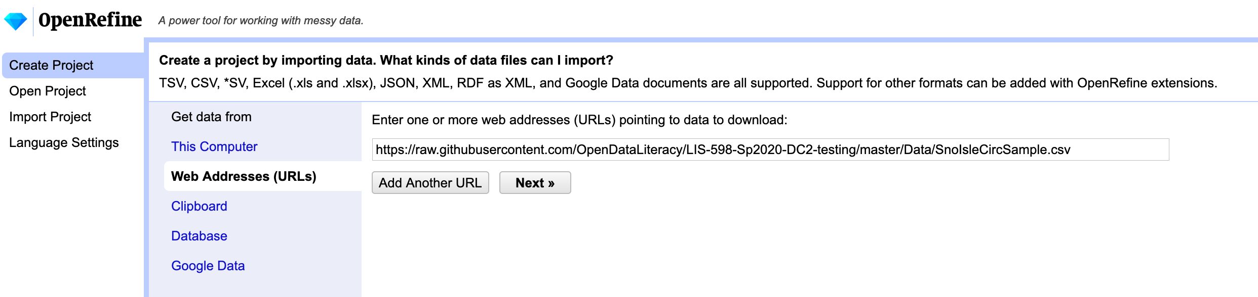
Each ILS will have its own unique method for generating data, it won’t always be a SQL query. This query resulted in 2,829,503 rows of data. It’s a large dataset that is too big to store here in Github, so we’ve cut it down to a nice sample of 100 rows to work with. If you click on the link, you will be able to see the data right in your browser which will be handy for reference, but for our next step, we will also be opening the data in the open-source application OpenRefine. If you don’t have it installed on your machine, you will find the download here.
OpenRefine is a tool designed to clean up messy data. Once you have it installed, open up the application (which will open and run in your default browser tab) and in the left menu choose “Create Project”. OpenRefine has a handy tool for using data from a URL, so you can choose “Web Addresses (URLs)” to start your project and enter the link above to the data (https://raw.githubusercontent.com/OpenDataLiteracy/Prepare_Publish_Library_Data/gh-pages/data/SnoIsleCircSample.csv). Click “Next.”
OpenRefine automatically tries to detect the separator used in the file, but allows the use to change the detection paramaters.
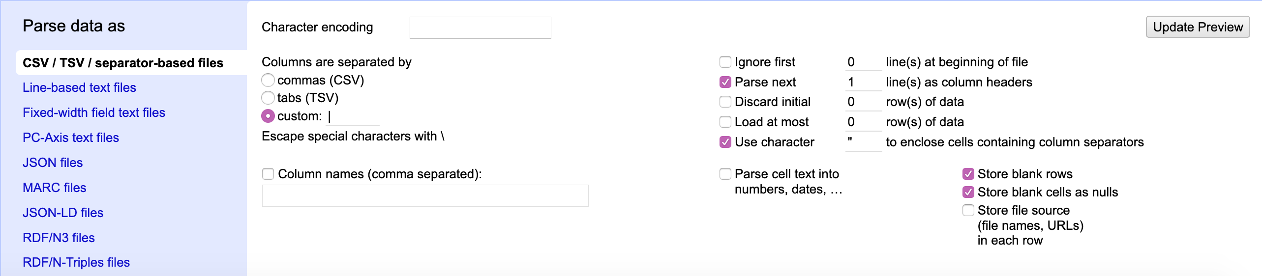
You’ll notice that the file is in comma-separated value (CSV) format. Does that match the reality of the file? How can you tell?
If you look at the raw data in your browser, and scan the first row, which in this case is the column header names, you will see that this file is NOT separated by commas, but rather by pipes (or vertical bars) |. This is not the most common of separator values, but OpenRefine still caught it and noted that the columns were separated by a custom value. If OpenRefine hadn’t detected this, you would want to change this parameter before continuing on with the data. You should also note that OpenRefine detected the first row as the column headers and has chosen to fill empty cells with NULL. OpenRefine can also auto-detect data types. This may be useful when cleaning the data later, so go ahead and check the box next to “Parse cell text into numbers, dates, …” These settings look fine for this dataset, but before continuing, take a look at the table shown above the parameters. Do you notice anything unexpected? How many columns has OpenRefine detected?

OpenRefine has detected 15 columns, 5 of which it has auto-named as “Column [#]”. It appears that many of the cells in these columns are empty and not even filled with “NULL”. When you scroll down a bit, you’ll notice that row 23 is the first row to include data within columns 11-15. Continue scrolling and you’ll notice that row 68 also contains data within those columns. Both of these entries are materials in Russian. Even if you don’t read Russian, you should be able to notice that CopyrightDate and the DataLastBorrowed columns are not matching up with the data correctly in these two rows. It turns out the the Cyrillic alphabet contains a letter called “Palochka” which is also the vertical bar. This is problematic for our file and will require “hand” fixing in a text editor (or Excel or Google Sheets, but I prefer a text editor). There may be workarounds to do this using only OpenRefine, but OpenRefine was not designed to manipulate individual rows and a text editor will be the fastest method.
There are many ways to import this file into a text editor. This tutorial will walk you through one way, but as described above you can also copy and paste from the browser data file or programmatically download the data file. Here we will continue using OpenRefine. Go ahead and click “Create Project” in OpenRefine. Next, “Export” the dataset as a “tab-separated value” file and save the file to your machine. Open the file in your favorite text editor (I like Visual Studio Code, but any text editor will work).
Your text editor probably won’t recognize the first row as the column headers, so column headers are Row 1 (in OpenRefine Row 1 was the first row of data because it had recognized the Column Header row). This is important because we will have to add 1 to the row numbers we identified in OpenRefine as needing fixing. So, let’s fix rows 24 (23+1) and 69 (68+1):
1 Meni͡ a zovut Sheĭlok : kaver-versii͡ a Venet͡ sianskogo kupt͡ sa Uilʹi͡ ama Shekspira INTL-RUS FIC JACOBSO Jacobson, Howard, author. EDM Izdatelʹstvo Ė, 2017 2020-01-03 11:21:07.667 International Russian NULL
1 Zloĭ rok Mariny ?T Svetaevoĭ : Zhiva?i a dusha v mertvoĭ petle INTL-RUS BIO TSVETAE POLIKOV Polikovskai︠a︡, L. V. (Li︠u︡dmila Vladimirovna), author. LYN ĖKSMO, 2013 2019-09-26 16:18:23.823 International Russian NULL
We exported the file as tab-separated so all the pipes are gone and a tab indicates each next cell. For the two Russian titles that are causing problems, we need to add the pipes back in because they are legitimate characters within the titles. If you don’t read Russian, how will you know where the title starts and ends? The first column is TotalCheckouts (an integer indicating how many times the title was checked out). So we know that the first integer is NOT part of the title. A tab then indicates we are entering a new cell. The second column should be the Title. We expect to see text or a “string” in this cell which is indeed the case. So how do we know where the title ends? The third column should be CallNumber, which we can see by looking at other examples in the dataset, is usually a combination of Dewey Decimal numbers and/or capital letters. In the case of the items above, we can identify what should be the third column by looking for text that is in all caps, both start with “INTL-RUS”. Since we can now identify the start and end of the titles, we can replace the tabs that occur WITHIN the titles with the original pipe character. After fixing, the rows should now look like this:
1 Meni͡|a zovut Sheĭlok : kaver-versii͡|a Venet͡|sianskogo kupt͡|sa Uilʹi͡|ama Shekspira INTL-RUS FIC JACOBSO Jacobson, Howard, author. EDM Izdatelʹstvo Ė, 2017 2020-01-03 11:21:07.667 International Russian NULL
1 Zloĭ rok Mariny ?T|Svetaevoĭ : Zhiva?i|a dusha v mertvoĭ petle INTL-RUS BIO TSVETAE POLIKOV Polikovskai︠a︡, L. V. (Li︠u︡dmila Vladimirovna), author. LYN ĖKSMO, 2013 2019-09-26 16:18:23.823 International Russian NULL
Now you need to save this file on your machine. Let’s name it “SnoIsleCircSample.tsv”. Now we can go back to OpenRefine and Create a New Project with this file. This time instead of importing the data from a URL, you are going to import the data from a file on your machine:
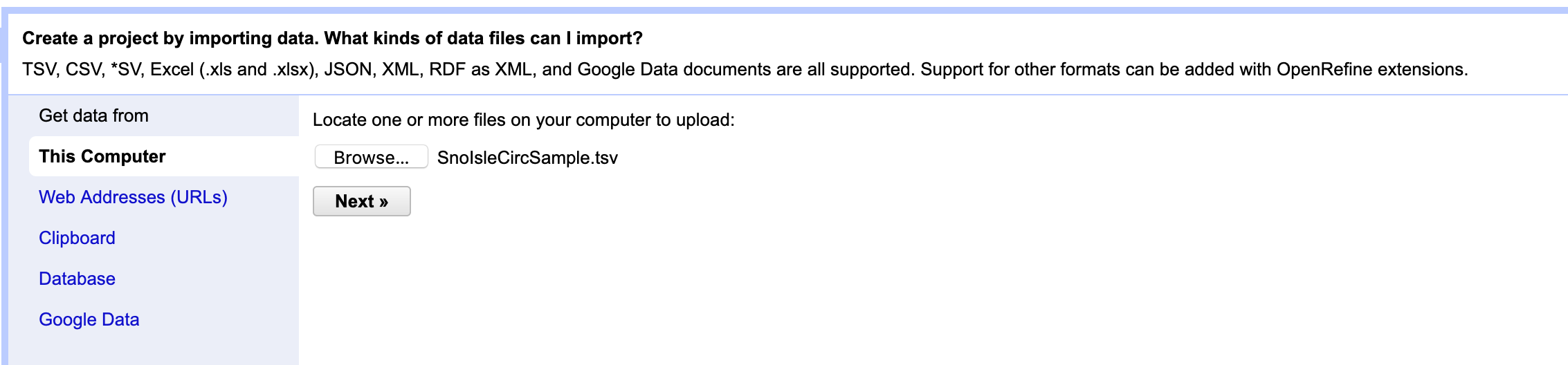
Browse for your file that you named SnoIsleCircSample.tsv and click “Next.” You will see a familiar screen. OpenRefine has auto-detected that the file is tab-separated this time and still recognizes that the first row contains column headings. Go ahead and choose “Parse cell text into numbers, dates, …” as you did previously. Now take a look at the column headings. What do you notice? There are still extraneous columns! Why is this? When we exported the file as tab-separated, every cell was included (even the blank cells). When we manipulated the file in the text editor, we did not remove all the extra tabs that came at the end of each row. We could have manually gone through each row and deleted the extra tabs, but that would be tedious and OpenRefine offers and easier solution. BUt first let’s double-check that our edits fixed rows 23 and 68. Scroll through the data and see if they end with the column “ItemCode.” Indeed, it appears that columns 11-15 are now entirely empty - which is what we want. So for now, go ahead and click “Create Project.”
Now we can begin cleaning the whole dataset with some simple options provided by OpenRefine. First, we know that Columns 11-15 are empty and we don’t need them. If you click the down arrow next to the heading “Column11” you will get a menu of options. Choose “Edit Column” and then “Remove this Column”. Repeat this for columns 12-15.
Tidy Data
Now that we’ve cleaned the more egregious issues, let’s take a look at this dataset through the lens of tidy data principles. By fixing the Russian titles, we have cleaned the values in our dataset so that each value is in one cell and has a corresponding observation (row) and variable (column). Use the previous chapter on Tidy Data to assess the observations and variables. Is this a tidy dataset or do we need to perform any transformations?
I would argue that the dataset meets tidy data principles. But for the sake of example, let’s practice separating a column. Let’s take the column “DateLastBorrowed” and split it into two columns, “Date” and “Time” (this is not necessary for tidying data, it is common to include the full date-time within one column). To perform a column separation in OpenRefine, choose the down arrow next to the column you want to separate.
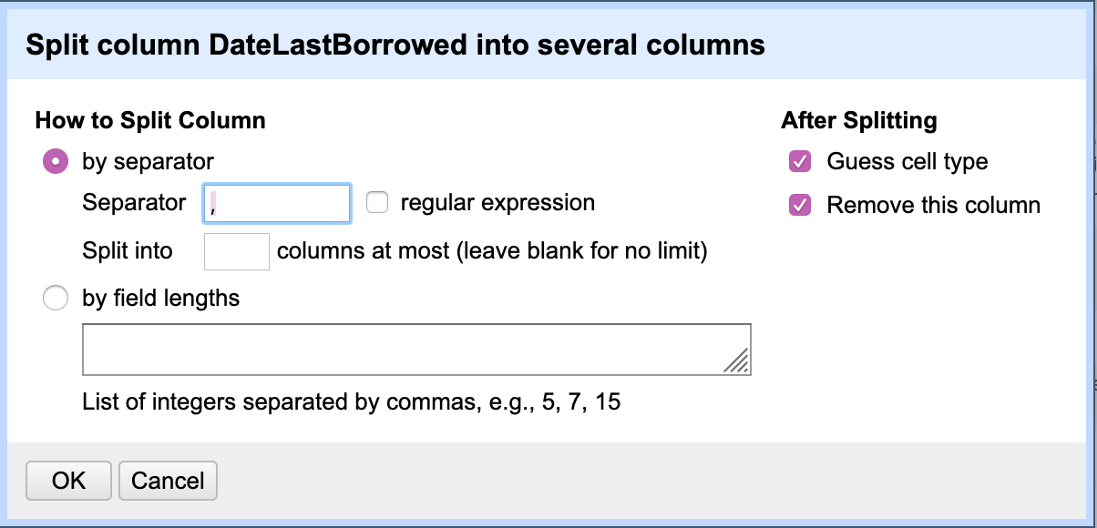
Next choose “Edit Columns” and “Split into Several Columns”. We need to tell OpenRefine where to make the split in the data. For this dataset it is relatively simple: a space separates the date from the time. In the pop-up window, you will want to choose “How to Split Column” “by Separator” and the default separator is a comma. We want to replace that comma with a space. Then you can check “After splitting” “Guess cell type” and “Remove this column”. This should have split the column in two, but autogenerated new column names, “DataLastBorrowed 1” and “DataLastBorrowed 2”. Those column headers do not adequately describe the columns, so let’s change them. For each of the two columns, click the drop-down menu and choose “Edit column” and “Rename this column”. You can now rename them “Date” and “Time”.
OK, I mentioned earlier that we didn’t really need to split the DateLastBorrowed column. Let’s return to the dataset pre-column splitting. OpenRefine includes a nice feature for capturing all the steps you’ve taken and allowing you to return to a previous version. In the left facet you should see a tab for “Undo/Redo”. Click that tab and hopefully you see something like this:
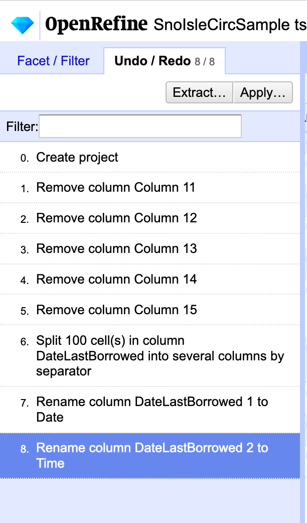
We want to return to the last step taken BEFORE splitting the column, which in this case is “Remove column Column 15”. Click that step. You should now see DateLastBorrowed returned to its original format. You can now export this file as a tab-separated file for publishing to a repository.
Key Points
First key point. Brief Answer to questions. (FIXME)